This is Part 3 of the Chrome Developer Tools Series. You can read the other parts here:
Google Chrome is a great browser for speed and flexibility. It’s also an awesome tool for front-end development. In this series of posts I will demonstrate how to use Chrome Developer Tools (DevTools for short) to help you style your WordPress theme. In this post, I will focus on knowing your way around the tool. (By the way, if you need a refresher on how to add custom CSS to your site, I wrote about it a while back.)
Opening Chrome Developer Tools
To open Chrome Developer Tools, go to your file menu and navigate to View > Developer > Developer Tools.
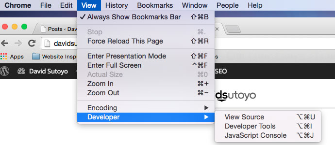
Since you will be doing this a lot, I recommend learning the keyboard shortcuts for calling up DevTools:
⌥⌘I (Command-Option-I; Control-Shift-I on Windows) opens Developer Tools.
⌥⌘J (Command-Option-J; Control-Shift-J on Windows) opens the JavaScript Console.
These two commands are the most commonly used. See this page for a full list of keyboard shortcuts you can use. To close DevTools, just hit ⌥⌘I again.
Moving the panels

When you open Developer Tools you will be greeted with some complex panes filled with code. You’ll also see eight tabs: Elements, Network, Sources, Timeline, Profiles, Resources, Audits, and Console. If you’re already overwhelmed, take a deep breath and relax. For CSS work, you’ll be spending probably 90% of your time in the Elements tab.
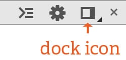
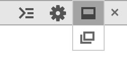
In its default view, Developer Tools opens underneath your page content. That is not the only view available. First, you can click on the dock icon to dock the DevTools window to the right of your page. You can use the dock icon to toggle the dock location between the bottom and the right.
There is yet another view. Click and hold the dock icon to reveal another icon. When you click this icon, DevTools will open up as a new window. This is particularly useful when you simply need more screen space to sift through the code and view the page itself.
Mobile emulation
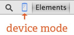
Another useful feature of Developer Tools is its device mode. Click on the smartphone icon to turn it on. You’ll see that your page area will shrink down to smartphone proportions. In this case, I recommend either docking the DevTools to the right or opening it up in a new window. Having the Tools at the bottom kind of cramps the mobile view.
When you turn on device mode you might notice that your content becomes really tiny. Chrome might warn you that you might need to reload the page for proper user agent spoofing and viewport rendering. Go ahead and reload so you’ll see the content properly.
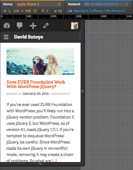
Above your virtual “device” you’ll see two dropdown menus: Device and Network. You can use the Device menu to emulate many different devices ranging from the iPhone to the Amazon Kindle. You can then use the Network menu to select data speed. Here Chrome will throttle your page speed to emulate cell phone networks.

Finally, you’ll see the circle-arrow icon next to the device dimensions. Clicking on the icon will change the device’s orientation.
Keep in mind that device mode is only an approximation of the selected device. Things won’t look exactly the way they do on the actual device, but it does a good enough job when you need to make a lot of changes to the code. I would recommend checking your work on the actual device before it goes live!
In the next part of the series, I will dive deeper into the Elements tab and show you how to manipulate the HTML on your page.

Is this just for the Apple OS? The instructions don’t seem to match Windows. I want to use Developer Tools to search the HTML for pathnames in style elements, but my experiments just search in the text of the project files.