Update: check out Photoshop Etiquette
Designers, let’s be honest — sometimes our deliverables just aren’t that organized. Sure, our design looks great, but when we pass our Photoshop and Illustrator files to the developers, they come back with questions like: Why is the green on this page not the same as the green on that page? How wide is the site supposed to be? The truth is, that mockup may look pretty, but it doesn’t provide nearly enough information to realize your vision. While this may seem like a minor impediment, I believe the lack of detail can snowball and negatively impact the entire project.
The issue I am referring to here is the lack of a system. When you are designing a website, you really are creating a visual system that gives the content structure. And for the most part, a well-structured visual system lends well to code. So what happens when that visual system is not clearly defined? At best, you’ll get peppered with questions that probably could have been answered earlier. At worst, the developer will end up (gasp!) making decisions for you. And that lack of a system? It becomes, well, systemic. But why should you care? Because at the end of the day, someone will pay for it. These decisions will be made at some point, and these decisions may lead to a codebase that is more expensive to maintain.
Here are a few things I learned from my own experience of creating these problems myself, and also from being on the receiving end of these files.
Communication
The most obvious tip might be the most difficult one to get right: early communication between the designer and the developer can resolve a lot of issues. This shouldn’t be the place where the developer tells the designer what he/she can’t do. Rather, it is a time when both designer and developer work together to understand the goals of the project and scope out a plan of attack. Maybe for budgetary reasons, the team is forced to use a pre-existing template. Or perhaps a video background is needed to communicate the brand’s message. Constraints exist on both sides, and communication is never a one-way street.
Use a grid
If you are eyeballing your content widths, you might be doing it wrong. For the vast majority of website designs, you’ll need to consider some very basic settings: how wide is the content area? How wide is the sidebar? How wide is the content margin? Are they consistent across different sections, and if not, is there a good reason for it? Having a grid system is a good way to answer these questions. A grid system is an essential part of just about any design project. If you are doing web design, you better be familiar with it.
Now a grid system may sound like a lot of constraints, but using a grid doesn’t mean your design will suffocate — it’s perfectly OK to break the grid for a good reason. Having a grid system will bring order to your designs and your developer’s code.
Develop a system for your typography
You’ve probably heard it before: web design is 95% typography. That’s because words are still the basis of our visual communication. I don’t think most designers need convincing that typography is important. What we need to consider, however, is how our typography supports the content throughout a potentially sprawling website. How big should the blog post title be? Should it be this big when presented as an excerpt on the home page? How then does that size compare to the other headings on the home page? While I believe most designers can easily answer these questions intuitively, it’s not always evident in our files. If your heading in your PSD is 27.64 px, then I have reason to believe that you just eyeballed it.
One way around this is to start using paragraph styles in either Photoshop or Illustrator. Using paragraph styles forces you to create a system and consider your type choices across your designs. Better yet, a developer can open up your file and see exactly the sizing and color choices you made for each typographic element.
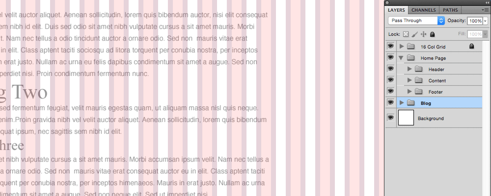
Organize your files
While I don’t think there is one right way to organize files, I believe it’s always a good idea start with grouping your layers. You can group them by type of content or section and then even color-code them. The important thing is that you have developed a system for organizing and finding objects in question. Another good practice is to name your file revisions. You can name them in sequential order (which I used to do), but naming them by date will give you more information at a glance. When sharing your files, I would recommend something more automatic like Google Drive, Dropbox, or BitTorrent Sync instead of email.
You are free to develop your organizational system as comprehensively as you like, but I think these couple of approaches will help answer two questions that your developer is probably always wondering: Where do I find this? and Is this file the most up-to-date?
Takeaways
You might have noticed a theme in this post: systems. If you’re a designer like me, then you enjoy bringing beauty into a design but tend to get bored with the minutiae of every. single. detail. But this is where we must recognize that they serve the same goal — details in a system provided order, which in turn structures beauty. And the cool thing about it all? Your developer — and your clients — will thank you for it.
Very good stuff. I am so glad to see your getting into blogging about what you know. 🙂